

The Dashboard is Dead, Probably?
There’s a movement by a few data analytics vendors (here’s one) that says, “dashboards are dead.” Most of this is slick marketing with a dose of clickbait (much like the title of this article). Visualizations are a great way to convey information and that likely won’t EVER change. But the promise of dashboards democratizing data for front-line workers and providing self-service analytics is still undelivered. And, as an employee of Microsoft, I fully understand that last sentence might be viewed as heretical. But…
Dashboards alone can’t solve key business problems. At the Microsoft Technology Center (MTC) we have a different approach. Power BI and Tableau won’t be going the way of the dodo anytime soon, but there are patterns that your analytics teams can leverage to gain information edge today. I do agree that we need to think differently about the role of the dashboard in the analytics landscape.
The Big Problems with Dashboards (…an Allegory)
Tell me if you’ve experienced this story before: 
CIO Sherrie: “Andy, I want you to build some dashboards that visually depict our company’s sales KPIs.”
Andy the Analytics Director: “Sounds good Sherrie, I’ll put my best people on it right away.”
Sherrie: “I’m so looking forward to what your team creates. We need to create actionable insights so our sales team can generate more sales.”
One month (or more) later
BI Developer Bev: “Sherrie, I want to review the dashboards I’ve created for you.”
CIO Sherrie: “Great. I’m so glad this is finally ready. Ah, I see you’ve incorporated the corporate colors into your visuals. Nice touch.”
Bev: “Let’s start by showing our sales visuals. First, we have a breakdown of sales by region. Note I’ve color-coded the sales by state. Pennsylvania has the highest sales volume, so it’s green.”
Sherrie: “Yeah, well, that’s because most of our stores and salespeople are in PA. Nothing too insightful there.”
Bev: “Um, well, ok. Here we have a breakdown of sales my month. Note here the sales go up substantially in the Spring time and trough in the winter.”
Sherrie: “Well, we sell consumer-grade pool supplies. No big surprise that sales increase in the Spring when everyone is anxious to get into their pools and stop buying when cold weather arrives.”
Andy: whispering…“Bev, I think you are losing Sherrie, why don’t you click into the sub-report and we’ll explain all of the data.”
Bev clicks and opens this dashboard…
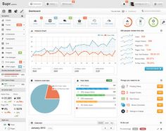
Sherrie: “Yikes, there is a lot of information displayed there. I really have no idea what this is trying to tell me. What conclusions should I make from this data?”
Bev: “Um..uh…well…”
Andy: interrupting “Sherrie, I’m so sorry, it seems like we didn’t deliver the dashboards you were hoping for. Could you help us understand exactly what you would like to see?”
Sherrie: getting perturbed “I already told you, I want to see dashboards that create actionable insights that will drive sales. These dashboards are telling me what I already know. The dashboards need to guide our sales folks on what to do next.”
Bev: whispering to Andy “Andy, I’m not in sales, I don’t know how to create actionable insights.”
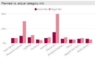
Sherrie: “…and another thing… I don’t just want to see the sales metrics, I want to know why the numbers are what they are. Look at the example on your screen…for the electronics category…why is the actual lagging the target mix so much? What can we do to fix that? This is what we need to know.”
Andy: “We’ll get right on this. We are so sorry for wasting your time.”
Truth be told, Sherrie nailed it, this dashboard didn’t tell her anything she didn’t already know. How can we, as data analytics professionals, solve this problem?
A Quick History of Business Intelligence
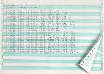 In the beginning, (think 1970’s-ish) businesses used data mostly for tactical purposes. We created “green bar reports” which consisted of printing the raw data from the database into an output (namely, paper) that was easy to handle and share in an age before everyone had a PC. The data was aggregated by a couple of levels, at most. Data was not time-critical.
These green bar reports were usually shared and passed around the division, annotated heavily with pen and pencil, and usually so worn from use that the ink would fade. These reports, with their annotations, drove more intelligence than most modern dashboards.
With the advent of what we now call “pixel perfect reports” in the 1990’s (basically, still green bar reports, but now a little more dynamic and easier to share), businesses could use reports for very specific purposes. “Here’s the report that proves to our auditors that we are in compliance.” Reports were used to manage risk and show facts (like sales) that could be used as the basis for more strategic business decisions. Data still was not time-critical. This data was usually sourced from a data warehouse that was batch loaded nightly.
Visualizations (line graphs and pie charts) were always available in spreadsheet and stats tools but it took some time before the average Citizen Analysts could use them intuitively over larger datasets. Today we can build a visualization over terabytes of data almost instantaneously. But is this providing business value if it is still telling me the same thing those green bar reports did in 1977: the bulk of our sales come from Pennsylvania. Have we advanced our business? The only benefits I see are slick new visuals and the ability to dynamically slice-and-dice data. We still aren’t answering Sherrie’s question: “What do we do to improve sales?”
None of this, by the way, is “business intelligence”…this is really just operational reporting with a spiffy front-end. Where is the actual “intelligence”? I did “Business intelligence” as an intern in the 1990s…we applied statistics and regression to create demand curves to determine product sales forecasts and help drive the product development teams. THAT was business intelligence! It answered Sherrie’s question…and that was 1995.
I posit that many companies still aren’t doing “business intelligence” as I just defined it. Are you? Yet I always see lots of dashboards.
BI’s meaning has radically changed over the years. Back in the 1990’s (maybe earlier) BI took the form of “What If” analytics, applying basic statistics to your data, and regression curves. We’ve dumbed-down BI over the last 30+ years to be operational reporting. We can do better.
At their inception (mid-2000’s), dashboards provided metrics and KPIs to knowledge workers without needing coding or querying knowledge. The analytics are done via simple drag-and-drop paradigms. But pie charts and histograms still don’t equate to cost savings or revenue generation. Business leaders, like Sherrie, still expect the dashboards to provide actionable insights.
Analytics Maturity Models
You’ve probably seen a variant of this graphic:
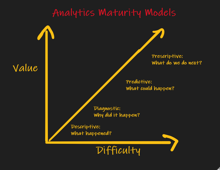
This maturity model is my term but I’m sure Gartner and Forrester have something similar. Most analytics leaders can tell you what the chart means but they can’t give a definitive roadmap on how to move from the lower left to the upper right. Here’s what the different levels of the journey mean:
- Level 0
Descriptive: this is rear-view mirror reporting. It is WHAT has happened. Its data source is historical data warehouse-style operational data. This is what green bar and pixel-perfect reports and most dashboards currently display.
“In the business world, the rearview mirror is always clearer than the windshield.” —-Warren Buffett
- Level 1
Diagnostic: this is sometimes lumped together withdescriptive. This analytics style tell you WHY something happened. Most reports and dashboarding tools today handle this level too. When you can drill-down, drill-across, or drill-through the data to determine why last month’s sales dropped, you are doing diagnostic analytics. This is alsoroot cause analysisand sometimesdata mining.
In Level 0 and 1 there is mathematically always a correct answer to the business problem. For instance, if the goal is to report Quarter Over Quarter sales then a business person will define the math needed for that calculation given the company’s data assets. Sometimes the math is even defined by industry standards like GAAP. We can prove and test if our formula works.
Level 2
Predictive: most dashboarding tools support this but it requires a little effort on your part and most companies still are not leveraging it. If I have historical (Level 0) sales data then I should be able to use simple linear regression to forecast sales into the future. This is also known asmachine learning. In theory, ML algorithms are not really black boxes and we can get inside of them and tweak the model weights and get a totally reproducible and explainable model. Said differently, we should be able to get one right answer given a set of inputs, but that rarely happens in the real world. Furthermore, if you ask 10 sales executives in your company how they calculate their forecast you’ll likely get 11 answers. The point is:predictiveis also opinionated, or often driven by gut instinct. Most companies are trying to move towards data-driven insights, where data is helping to guide or decision making. Which is what Sherrie wants. That leads to:Level 3
Prescriptive: few dashboarding tools support this and when they do it is your responsibility to spend the time to program it. Think ofprescriptiveas answering the question: Given all of these data inputs, what should I do next?. In the industry this is known asNext Best Action(sometimes abbreviated NBA or NBX). The Action depends on your use case and industry. If I’m in the insurance industry and I have a valuable customer I would like to up-sell/cross-sell to, the NBX is called Next Best Recommendation. There are many inputs into NBX and it requires knowledgeable business people to sit with analysts and programmers and think through the inputs to each use case.
This level never has one right answer. It is totally up to how you interpret the data and which data you plug into your formulas. These formulas will need to change over time as you gain experience and measure your model’s outcomes and elicit feedback from users. Maybe even do some A/B Testing. There is rarely guidance on these formulas from industry standards bodies and even within a company different teams may want to weight the inputs differently to suit their needs. Many times prescriptive analytics’ outputs can’t be displayed as a spiffy data visualization on a Power BI report. Sometimes the NBX is a simple binary decision: Should I cross-sell my new product to this customer, or not? The answer may be quite nuanced.
That’s the key to prescriptive analytics…using data to tell a story and be more data driven and less gut driven. Now, how do you display that decision on a dashboard? Does the dashboard provide any value in this case? Or is the real value in having discussions around what data inputs are needed, how to structure the formula, and ultimately what the outcome is (and can we measure it and learn from it)?
Another example of Prescriptive Analytics
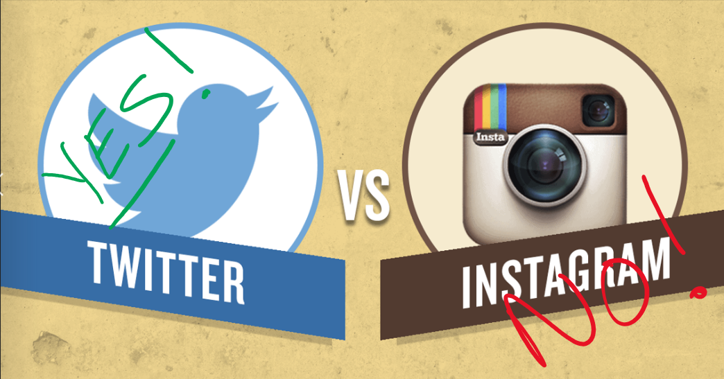
Imagine you are a marketing department spending $10M on various Facebook marketing campaigns. Your CMO asks you: “What should our next marketing campaign be…Instagram or Twitter?” That’s NBX. That’s “what should we do next?”. Now think to yourself…What would that dashboard look like? I have no clue what that would look like. Maybe something like this?:
Joking aside, what your CMO really wants is an ROI analysis: “Which campaign will provide the best positive ROI?” Again, this is not something that really requires a dashboard. Right? What the CMO and marketing team will want to do is turn the knobs on the ROI calculation and see what happens (What If Analysis). Then they’ll want to debate and have a conversation on the data inputs and have your analytics team adjust the formulas on-the-fly. There will definitely be visualizations needed, but probably these are throw-away and would never be added to a production dashboard.
Problems (and solutions) with Dashboards and Dashboarding Tools
My little allegory above points out a lot of the problems with the current state of dashboarding:
- information overload: We have a
 predilection to build dashboards that are too busy. It’s just bad design. The cognitive load is too high. Listen, I can’t design a dashboard. Everyone hates my dashboards, and for good reasons. I am far too left-brained. But I do know information overload when I see it. My advice if you design dashboards: read everything by Edward Tufte, he knows how to visually display data. And of course, listen to user feedback.
Dashboard information density is inversely proportional to value-generated. A little white space on a page is a good thing. Don’t fear the white space.
- we don’t design for the persona: Dashboard authors rarely try to understand the “personas” that the dashboards should be designed for. Is this dashboard meant for System 1 or System 2 thinking? System 1 thinking is reflexive and requires little cognitive load to understand. System 2 is slow, analytical thinking. If you are designing a dashboard for a customer service rep persona to quickly see the “state of the customer” when the customer calls the call center (aka Customer 360)…you want a System 1 dashboard. It will have lots of traffic lights and gauges that will quickly tell the rep exactly how to handle the customer, with almost no thought or effort. But, if I’m building a customer dashboard for a salesperson persona, I want it to be far more analytical. I want the dashboard to tell my salesperson a story about the customer’s history, make some predictions about future sales, and even provide a next best action. This is far more analytical.
Don’t overwhelm your user with lots of data, yet little information.
- dashboards rarely tell a story. Assuming a System 2 dashboard, data should always tell a story. What is the information you want to convey to your users? Take your users on a journey. Remember, I’m right-brain challenged, but here’s how I like to start a data journey (please don’t judge me based on the visuals, look instead at the picture I’m trying to paint):
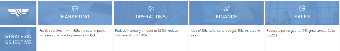
I list the purpose of each section of the dashboard starting with the metric or OKRs for each department/persona. Each subsequent drill-down visualization should display some data attribute that is important to achieving that metric. Along the way I want users to be able to explore the data and ask their own questions. This is difficult for any dashboarding tool. Query interfaces in most of these tools are cumbersome and feel like a bolt-on extension. There are better ways to enable exploratory data analytics (EDA) than a dashboarding tool.
Here I’ve drilled into the marketing OKR and see this:
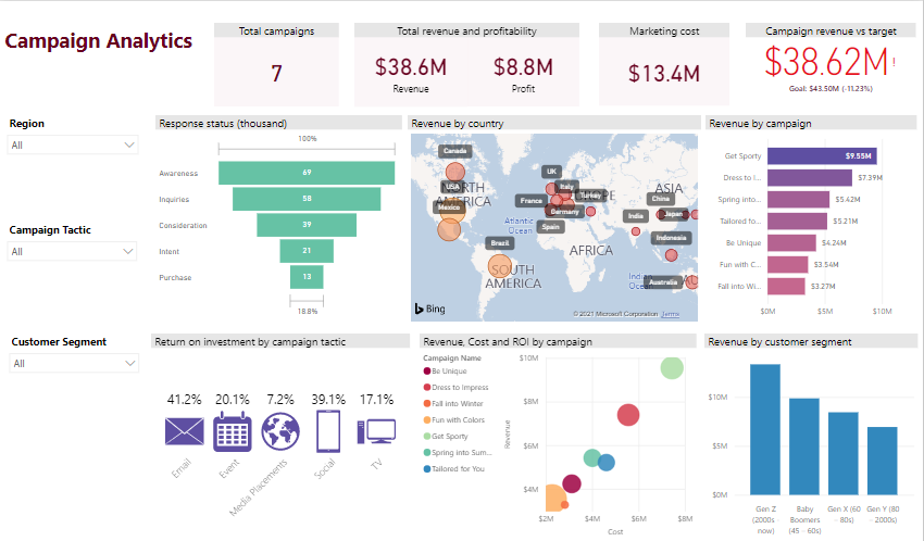
Again, forgive me for the terrible visuals but I’m trying to paint a picture (note that in some visuals we are “in the black” and others we are “in the red”). Looking at the lower right I see the distribution of revenue by customer segment (by age demographic). Now, these “the dashboard is dead” vendors insist that dashboarding tools can’t provide any additional insights into this metric. I disagree. What I’ve been showing you is a sample Power BI dashboard I’ve created. Note that I can choose “Analyze” on this bar chart and Power BI will offer to tell me what factors affect the distribution of Revenue by Customer Segment the most:
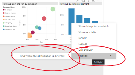
Power BI will tell me about the proportions of revenue for each input. In this case I can how media placements are affecting the demographics:
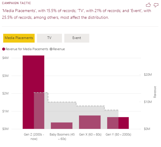
This might be meaningful for our marketing team. It definitely gives them some ideas they can research on their own (self-service analytics) before they ask the analytics team for additional help. In my experience they’ll need help because…
- predefined dashboards are constraining: Visual-based data exploration is a great start to data analytics but you soon get boxed-in. Whenever I’m looking at a new dataset for a customer I start by doing some basic data profiling. I look at the data in a histogram and “see” if there are any outliers. If the data is time-series I look at the data visually to see if there is seasonality in the data. But even with advanced dashboard training the average knowledge worker can’t ask their own questions of the data unless the underlying data can be queried directly. Dashboard tools expect the data to be modeled a specific way that may not support Citizen Analysts from asking their own questions or trying to determine which insights are the most important or actionable. The data is only as good as the dashboard’s context which leads to time-consuming, error-prone data exploration that might lead to bad conclusions, assumptions, and decisions. (BTW, anecdotally, this is the most cited reason I hear from executives as to why they fear Self-Service Analytics).
Dashboards have failed to deliver on the promise of a data-driven culture. –Quote from one of the “Dashboards are dead” vendors. (I don’t believe this).
Providing a dashboard is not the same as allowing a knowledge worker to have true Self-Service analytics.
But…modern dashboards give the user lots of opportunities to explore the data and answer questions that these “dashboards are dead” vendors conveniently overlook. Imagine you saw this visual and had no other context:
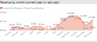
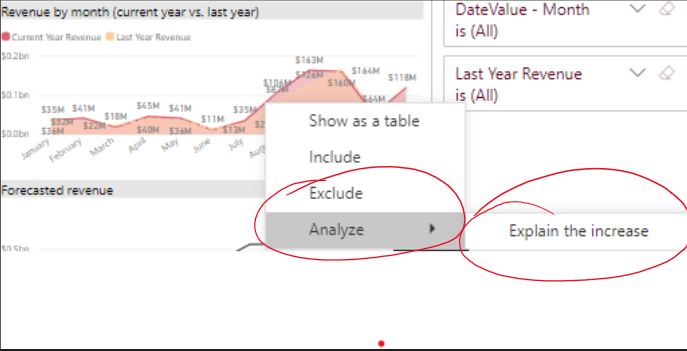
What would be the first question you asked? Would it be “What caused that increase in revenue for July, August, and September? Well, Power BI (and most other modern dashboarding tools) can do this:
Power BI tells me that the 207% increase in revenue for July to August is due to changes in 3 products we sell.
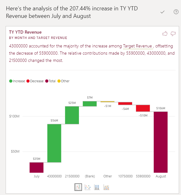
That’s really helpful.
Other dashboarding features these the Dashboard is Dead vendors conveniently omit
There are a lot of other features that modern dashboarding tools have that allow for some basic exploratory data analytics:
- NLP (Natural Language Processing). This allows you to ask questions of your data without understanding SQL. Here’s an example:
In this case I type a natural language question and Power BI presents me with some ideas on what I might want…as well as one possible answer.
Chatbots. These are meant to guide the user/analyst through a series of questions about the data. This is getting closer to guided analytics.
Wizard-like interfaces. If you are look me, these are sooo helpful. If I drag a data element onto my dashboard Power BI will give me a wizard-like interface that will help me determine what visual might look best.
Where these vendors get it right
These vendors do have a point. In 2021 dashboarding alone will not provide the insights that enable true Prescriptive Analytics. But the dashboard isn’t dead. It’s not even dying. Visualizations are the best way to convey numerical information. What the analytics industry needs to do is understand there are multiple personas that need to do true Exploratory Data Analytics and need something more advanced than a dashboarding tool. Executives have created self-service analytics projects and their ROI isn’t great. We can do better, without throwing the baby out with the bathwater.
How can the MTC help?
 Are you convinced your dashboards are giving your organization the insights it needs? Are you getting the most value from your data assets? Most of our customers at the Microsoft Technology Center believe they can do better. And we can help.
The MTC mandate is to be the Trusted Advisor for our customers. We do that by showing how data can add business value. Sometimes that’s a dashboard, other times that’s understanding how the modern analytics technologies can be leveraged by business analysts to unlock value. Every day MTC data scientists like me work with customers to show them how we think through answering difficult Prescriptive Analytics problems with data. The fact is, anyone with a modicum of SQL knowledge can do amazing things with data.
We provide hackathons and Rapid Prototypes where our customers’ analysts learn how to Think Like a Data Scientist and monetize their data. Our data architects know that data projects are risky with a high fail rate. We structure 2-3 day workshops with business goals YOU define. We want you to walk away thinking “we learned a lot and WE CAN DO THIS”. The tech is actually really easy, where companies struggle is understanding processes and patterns that really work.
If that sounds compelling, contact me on LinkedIn and we can work with your team to show you how to build compelling dashboards and answer difficult Prescriptive Analytics problems.
Are you convinced your data or cloud project will be a success?
Most companies aren’t. I have lots of experience with these projects. I speak at conferences, host hackathon events, and am a prolific open source contributor. I love helping companies with Data problems. If that sounds like someone you can trust, contact me.
Thanks for reading. If you found this interesting please subscribe to my blog.
Related Posts
- Data Literacy Workshops
- Software Implementation Decision Calculus
- MTC Data Science-as-a-Service
- Top 10 Data Governance Anti-Patterns for Analytics
- The Dashboard is Dead, Probably?
Dave Wentzel CONTENT
Data Architecture Digital Transformation